Role
Design Leadership
Platform
Desktop / Responsive
Team Size
1 SM, 1 PO, 1 BA, 5 engineers
Duration
2 years +
Digitalizing the food court model
The problem: how to let users order from multiple brands at once without surprising them at checkout.
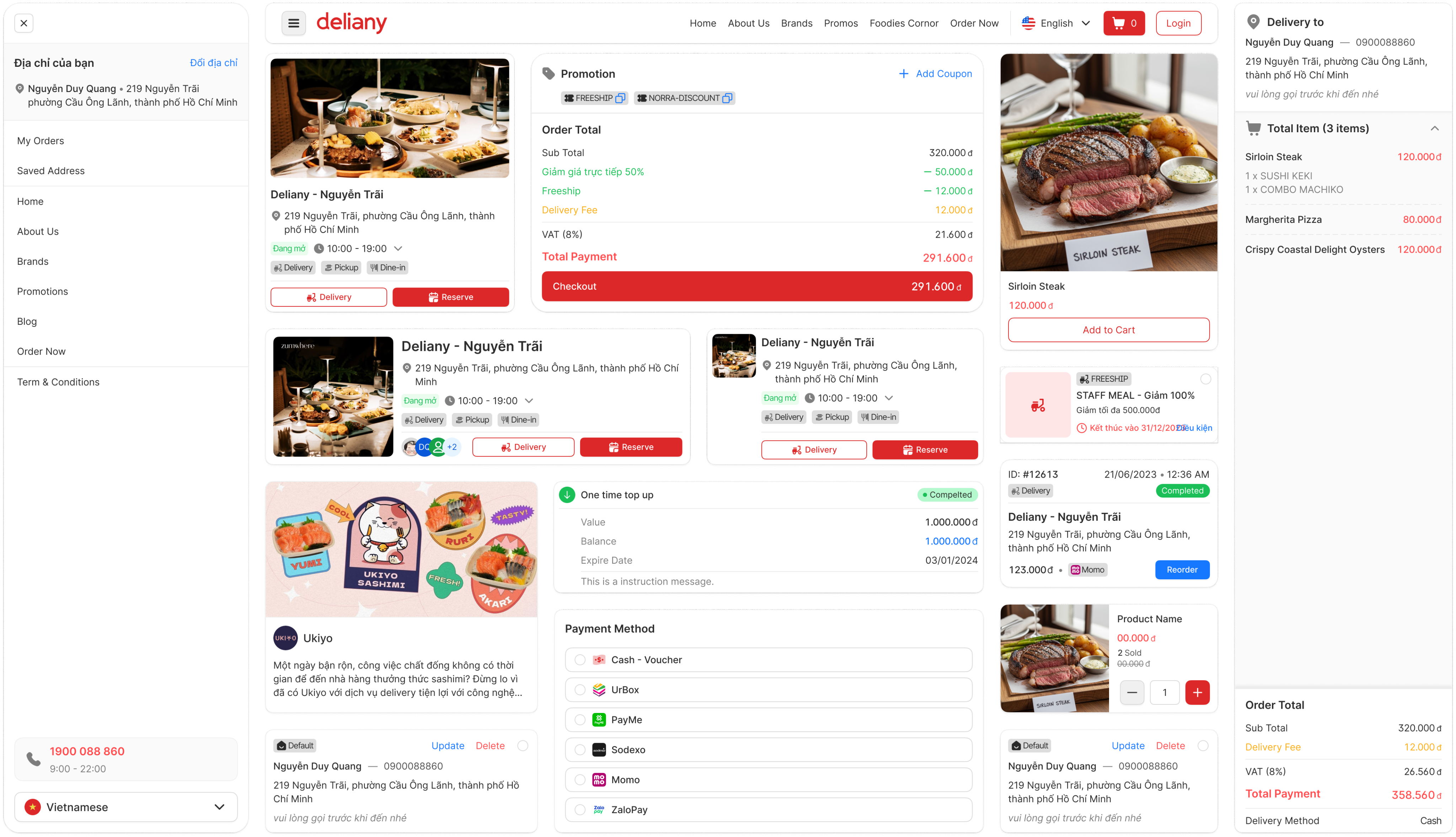
Deliany is a multi-vendor food ordering and delivery platform, designed like a digital food court — users can order from multiple brands at the same time.
As the sole designer, I owned the entire user journey — from discovering a location, to choosing dishes, to checkout. The job was not just 'designing screens' — I had to understand how users think and how a food court actually works.
Problem
The gap between reality and digital
In a real food court, guests typically pick a seat first → then go get their food.
But digital platforms run on a brand-first model — users find the brand before seeing the location.
Result: users unknowingly add items from branches at two different locations — only to find out their order was split and delivery fees doubled at checkout.
3 business questions to answer:
- Is the user browsing items from one location or multiple locations at the same time?
- Does the same brand have different menus at different branches?
- How do we handle order splitting and delivery fees without surprising the user?
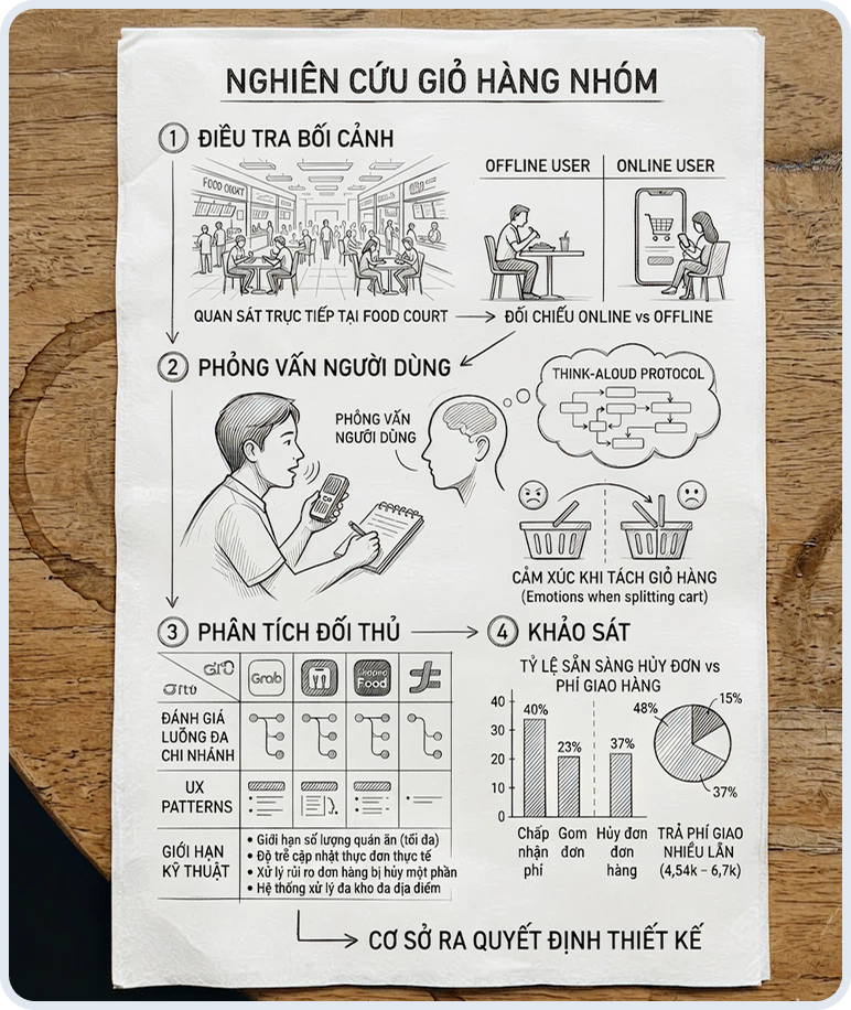
Research
Contextual Inquiry
- Observed group dining behavior: choose a spot → split up to get food → return to the same table
- Confirmed: "choose location first" is the natural behavior, not "search brand first"
User Interviews
- Target users: people who order food for a group
- Focus: emotions when the system forces a mid-session cart split
- Finding: this is the top frustration — not the extra cost, but the lack of warning
Competitor Analysis
- Reviewed how major food delivery platforms handle multi-branch carts
- Conclusion: most force users to pick one restaurant — none solved the multi-brand problem
Surveys
- Measured how many users would cancel rather than pay multiple delivery fees from an unexpected order split
- Results used to prioritize solving location transparency before the checkout step
Solution
Process principles
- Don't let users be surprised at the final step.
- Everything about order splitting or delivery fees must be stated upfront — right when selecting items.
Problem: Previously, users browsed items across multiple brands without knowing which brands shared the same delivery location — leading to confusion that built up until checkout.
Solution: Reverse the discovery flow — select a location first, then browse brands, then choose items.
- Within a location: show multiple brands
- Within each brand: show multiple items
Users can still view items from other locations — exploration is not restricted — but the system always clearly shows which location they're viewing, so customers know upfront how this will affect their order.
Flip the discovery order — location first, brand second
Before
After
Process
Search brand → select item → order split at checkout
Select location → browse multiple brands → choose items
Cart grouped by brand, transparent by location
- Displayed top to bottom, grouped by brand
- Brands at the same delivery location → combined into 1 cart, 1 delivery fee
- Different location → notified immediately when selecting an item, before adding to cart
Handle order splitting — notify at the item selection step so users are not surprised
Situation
Before
After
Same location
Unclear, users didn't know in advance
Notified immediately: items will be grouped into 1 order, 1 delivery fee
Different location
Users only found out at checkout
Notified immediately when selecting item, before adding to cart: order splits into 2, delivered twice, 2 separate fees
Customers can still view items from other locations — but the system always clearly shows which location they're viewing.
Checkout — one confirmation even if the order is split
- Before: each split order required separate verification → customers had to confirm multiple times
- After: 1 single verification → the system automatically routes each order to the correct delivery address
Problem:
Previously, when an order was split by location, each split order required a separate payment verification — customers had to confirm multiple times for a single purchase.
Solution:
Consolidate verification into a single step. Once the customer completes payment and verification, the system automatically handles the rest — routing each order to the correct delivery address, even if the order was previously split by location.
Customers go through only one payment confirmation — the complexity of order splitting is entirely handled by the system, not pushed back to the customer.
Results & Feedback
Metric
Result
Order completion time
Faster — customers no longer worried about orders from different delivery locations
Discovery experience
Users reported it was easier to browse across multiple brands and order from them at the same time
Digitalizing a food court is not just about putting menus online.
You have to understand how users shop at a food court — then reflect that flow back on screen in a way that fits.
The biggest issue is not that orders get split — it is whether users know in advance that things can get complicated.
Telling users an uncomfortable truth upfront is always better than letting them discover it at the very last step.